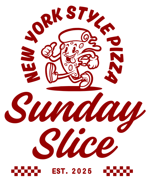
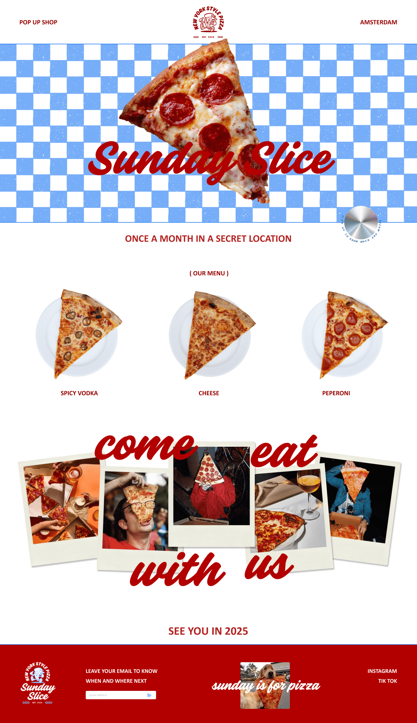
I had the opportunity to create the branding and website for Sunday Slice, a pop-up event restaurant in Amsterdam serving authentic New York-style pizza. True to its name, Sunday Slice will appear in random locations across the city on select Sundays in 2025, revealing the secret spot and time exclusively to its members just a week in advance, adding a playful and exclusive twist to the pizza experience.
For the branding, I crafted a bold and playful logo inspired by a pizza slice, infused with the vibrant energy of NYC. The color palette features a classic pizza red (#B22423) paired with a fresh, modern blue (#76ADF8), creating an unexpected yet eye-catching contrast. To complete the look, I incorporated elements like the iconic checkered tablecloth, a nod to traditional pizzerias, reimagined with a modern edge.
The website brings this concept to life with a clean, engaging design that balances old-school charm with contemporary flair. Subtle touches of humor (because pizza should never take itself too seriously) and dynamic visuals capture the thrill of discovering each new pop-up while celebrating the joy of sharing great pizza in unexpected places.
PLATFORM
Desktop
MY ROLE
Branding / UI – UX
I had the opportunity to create the branding and website for Sunday Slice, a pop-up event restaurant in Amsterdam serving authentic New York-style pizza. True to its name, Sunday Slice will appear in random locations across the city on select Sundays in 2025, revealing the secret spot and time exclusively to its members just a week in advance, adding a playful and exclusive twist to the pizza experience.
For the branding, I crafted a bold and playful logo inspired by a pizza slice, infused with the vibrant energy of NYC. The color palette features a classic pizza red (#B22423) paired with a fresh, modern blue (#76ADF8), creating an unexpected yet eye-catching contrast. To complete the look, I incorporated elements like the iconic checkered tablecloth, a nod to traditional pizzerias, reimagined with a modern edge.
The website brings this concept to life with a clean, engaging design that balances old-school charm with contemporary flair. Subtle touches of humor (because pizza should never take itself too seriously) and dynamic visuals capture the thrill of discovering each new pop-up while celebrating the joy of sharing great pizza in unexpected places.
PLATFORM
MY ROLE
Mobile
Branding / UI – UX
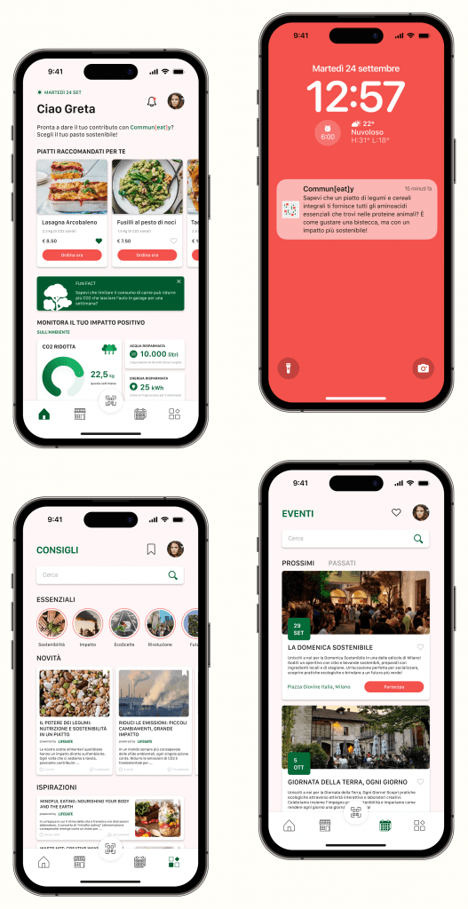
I worked on Communeaty, an emerging startup in Milan focused on healthy, sustainable meal vending machines near kiosks. I designed the app screens and developed the branding, including the logo and color palette, to create a cohesive and engaging identity.
The logo, inspired by a map, symbolizes the network of vending machines and the sense of connection within the community. The colors reflect the brand’s essence: #F4524D evokes the warmth and vibrancy of fresh, healthymeals, #FFF7F7 adds a touch of lightness and approachability, and #046A38 grounds the design with the freshness of nature and sustainability.
The app enhances the shopping experience and fosters community through features such as:
A dashboard to track the potential environmental and health impact of purchases.
Push notifications with fun facts and tips to keep users engaged.
A blog section for articles where users can comment and share their thoughts.
Information about future events centered around sustainable eating organized by Communeaty.
PLATFORM
Mobile
MY ROLE
Branding / UI – UX
I worked on Communeaty, an emerging startup in Milan focused on healthy, sustainable meal vending machines near kiosks. I designed the app screens and developed the branding, including the logo and color palette, to create a cohesive and engaging identity.
The logo, inspired by a map, symbolizes the network of vending machines and the sense of connection within the community. The colors reflect the brand’s essence: #F4524D evokes the warmth and vibrancy of fresh, healthymeals, #FFF7F7 adds a touch of lightness and approachability, and #046A38 grounds the design with the freshness of nature and sustainability.
The app enhances the shopping experience and fosters community through features such as:
A dashboard to track the potential environmental and health impact of purchases.
Push notifications with fun facts and tips to keep users engaged.
A blog section for articles where users can comment and share their thoughts.
Information about future events centered around sustainable eating organized by Communeaty.
PLATFORM
MY ROLE
Shopify
UI – UX / development
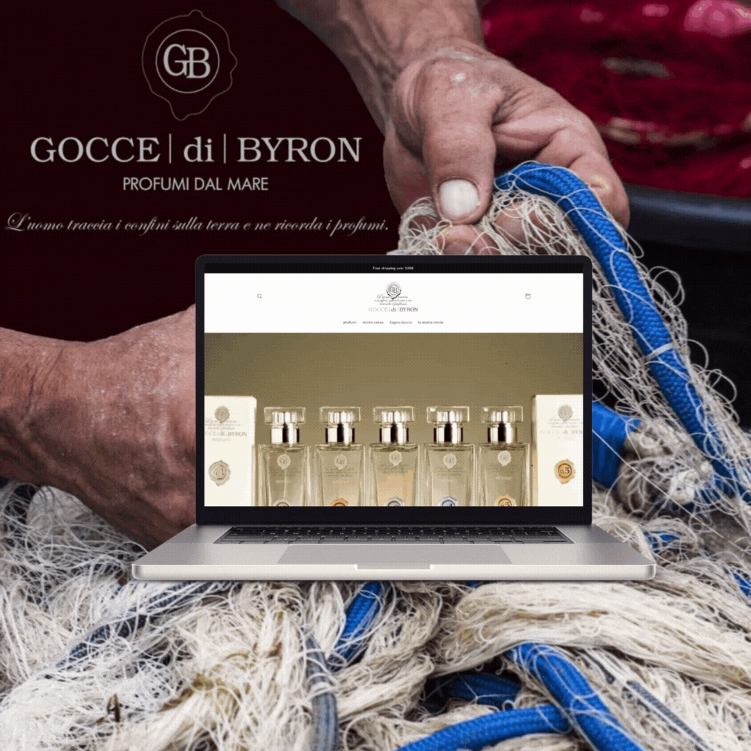
For the Italian perfume brand Gocce di Byron, based in Portovenere, I developed a full Shopify e-commerce website. I designed a seamless shopping experience that reflects the brand’s luxury and artisanal essence. The website showcases their range of perfumes with a refined layout, integrating smooth navigation and a secure checkout process. Custom features were added to enhance the user experience, including product storytelling and visual elements that evoke the brand’s connection to Portovenere’s coastal charm and history.
PLATFORM
Shopify
MY ROLE
UI – UX / Development
For the Italian perfume brand Gocce di Byron, based in Portovenere, I developed a full Shopify e-commerce website. I designed a seamless shopping experience that reflects the brand’s luxury and artisanal essence. The website showcases their range of perfumes with a refined layout, integrating smooth navigation and a secure checkout process. Custom features were added to enhance the user experience, including product storytelling and visual elements that evoke the brand’s connection to Portovenere’s coastal charm and history.