Crafting the Perfect Matcha in a can: from Analysis to Design
Introducing canned matcha to Italy. Complete case study covering ideation to launch, market research, branding, and social media strategy.
TIMELINE
NOV 2023 – DEC 2023
PLATFORM
Desktop
MY ROLE
Branding / Research / UI – UX Designer
INTRODUCTION
Matcha, highly favored for its rich history in Japanese customs, gains modern popularity for its unique flavor and health benefits. Derived from the Yabukita tea plant, it differs from typical teas by ingesting powdered leaves. Its abundant antioxidants, especially EGCG, interest wellness enthusiasts for potential health advantages.
The rising trend of Matcha green tea, appreciated for its intricate production and distinct taste, contrasts with traditional coffee’s impact on mental clarity. Recognized for its caffeine alternative, Matcha addresses tiredness without causing agitation.
The initiative of “Matcha Time“, introducing canned matcha beverages in Italy, seeks to familiarize the Italian market with Japanese tea traditions through a variety of flavors.
This case study will explore the design process of the brand, with particular emphasis on the user experience (UX/UI) aspect.
BACKGROUND
I’m a huge matcha enthusiast and consume it daily, both at home and when out at cafes.
During my travels, especially in the United States, I’ve observed a surge in the popularity of canned beverages, with thousands of new brands, particularly those focused on health.
GOALS
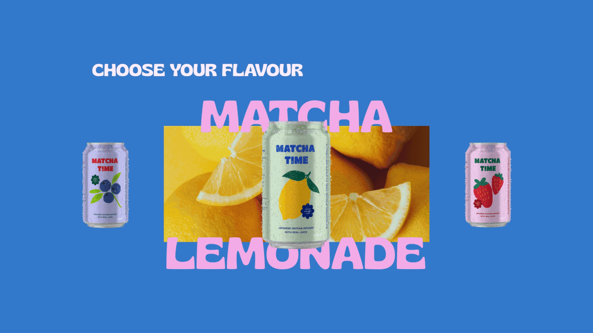
Creating a distinctive brand: developing a unique visual identity for “Matcha Time“, including the name, logo, and can packaging.
Designing a user-friendly website: creating an intuitive website to allow users to discover and purchase “Matcha Time” beverages.
Methodology
I started with researching and selecting the brand name, ensuring it’s unique and representative of the product. I developed a visual identity, including a logo, colors, and style consistent with the brand’s personality.
I created the designs for the cans, including labeling and packaging.
I defined a marketing strategy involving brand positioning in the market and identified the target audience.
I developed a comprehensive website reflecting the brand’s identity, featuring product information, e-commerce functionality, and an engaging user experience.
Market Analysis
“Matcha” signifies a rising global trend, drawing 799,000 monthly Google searches from wellness enthusiasts and health-conscious individuals. The global Matcha Tea market, valued at USD 308.8 million in 2022 and expected to reach USD 532.6 million by 2029 (with an 8.0% CAGR), notably thrives in Japan due to its health benefits and cultural significance.
The evolving demand for plant-based, sugar-free, and artificial flavoring-free foods has transformed the Ready-to-Drink (RTD) sector across Europe, particularly in Italy. Cold beverages, replacing flat and carbonated drinks or fruit juices, have gained significant market share, with cold tea ranking as Italy’s second most consumed beverage after Coca-Cola.
In 2018, Italy saw a notable increase in tea and infusion purchases, reaching 157 million units valued at 303 million euros, indicating a 4.7% volume increase and a corresponding 5% rise in value from the previous year.
The Covid-19 pandemic heightened health awareness, influencing consumer preferences towards healthier beverages like cold tea, herbal drinks, and those with fewer artificial ingredients. Italian consumers now prioritize ingredient quality and sustainable packaging, with a growing preference for environmentally friendly canned beverages.
Given this landscape, the introduction of a canned matcha beverage aligns well with evolving Italian preferences. Matcha’s novelty, combined with its health benefits, holds promise for satisfying the growing demand for unique, plant-based, and healthier beverage alternatives in Italy and Europe.
target
The target audience of “Matcha Time” primarily consists of young adults between 18 and 35 years old, focused on a healthy lifestyle, personal well-being, and environmental sustainability. This demographic is particularly keen on exploring new avenues for improving health and wellness through natural and sustainable products.
Additionally, there is a subset within this audience showing specific interest in matcha, attracted by its health properties and reputation as an energy source without causing palpitations or headaches, unlike some energy drinks. These individuals might be seeking healthier alternatives for energy throughout the day while maintaining balance without dependency on stimulants.
Furthermore, there’s a dynamic “on-the-go” group who might appreciate matcha for its convenience and versatility as a beverage. These individuals might be seeking quick solutions to boost energy during busy days without compromising health or becoming reliant on stimulants.
In summary, the target audience for “Matcha Time” is centered around health-conscious young adults, with a subgroup specifically interested in matcha’s beneficial properties and another part looking for practical and healthy energy solutions without negative side effects.
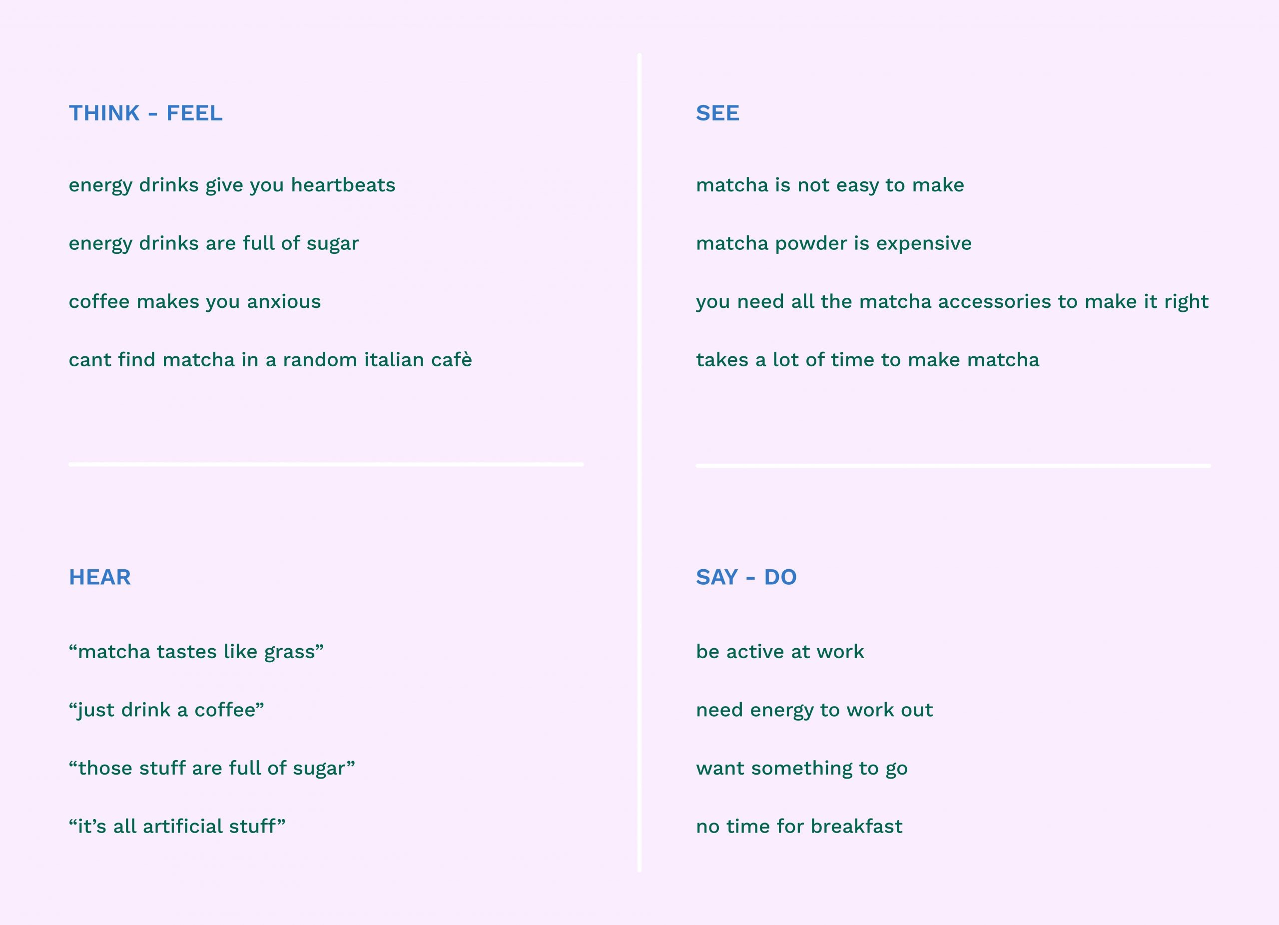
Empathy map
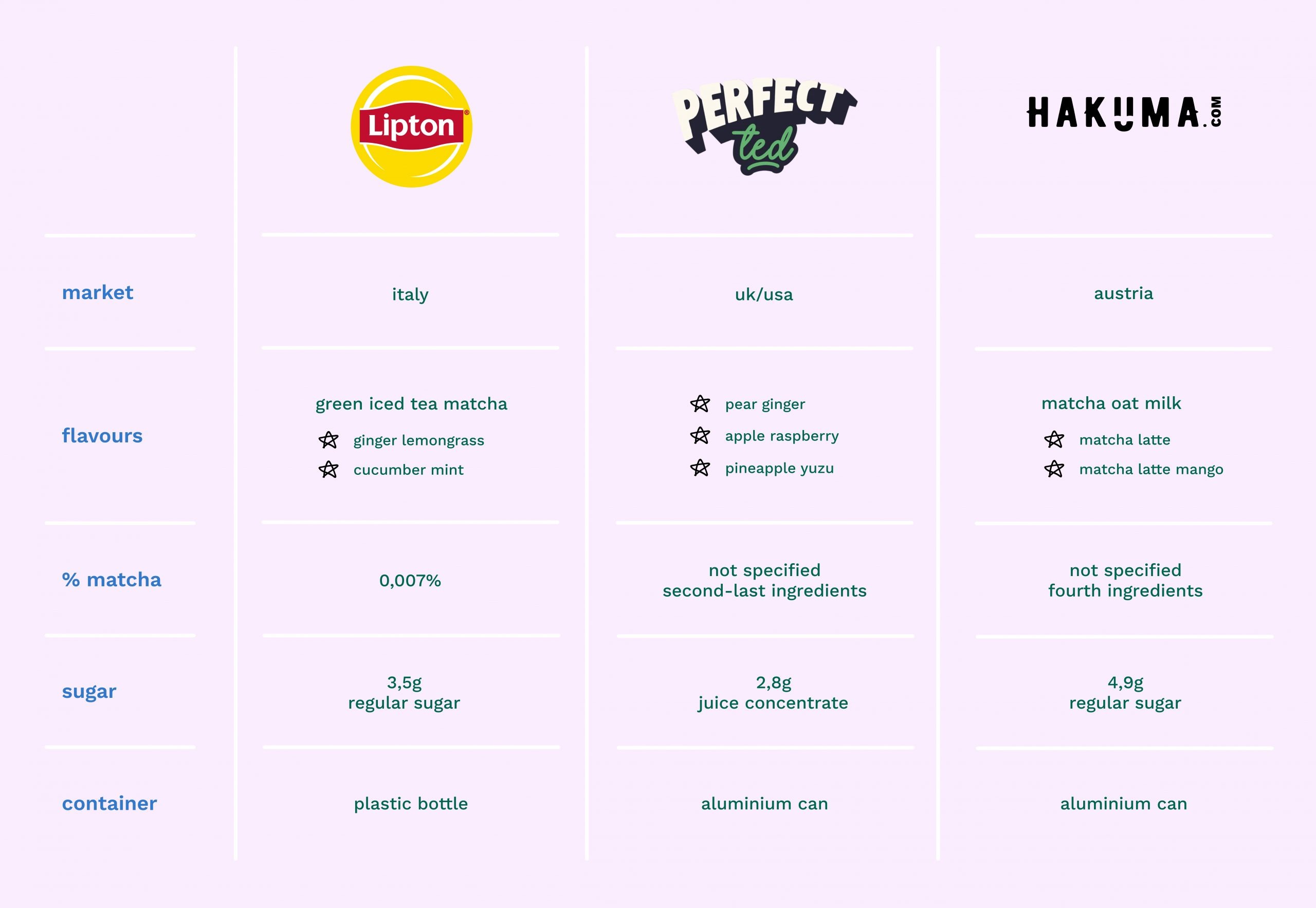
Competitive Research
In Italy, there are currently no direct competitors in the matcha drink in a can market; the only possible competitors is Lipton that has introduced a ‘Green Ice Tea’ with a little amount of matcha inside.
However, within the European landscape, I’ve identified two potential competitors: PerfectTed and Hakuma.
naming
The name “Matcha Time” is memorable, forging a strong association with the product since it evokes feelings of pleasure and relaxation, hinting at the delightful experience of consuming matcha. The inclusion of “Time” implies a moment for relaxation or enjoyment, appealing to those seeking such moments in their daily lives.
Its adaptability shines across various marketing contexts, serving as a slogan or a call-to-action that encourages individuals to pause and relish matcha.
Moreover, being an English name in an Italian market, “Matcha Time” maintains easy pronunciation and readability, ensuring accessibility to customers.
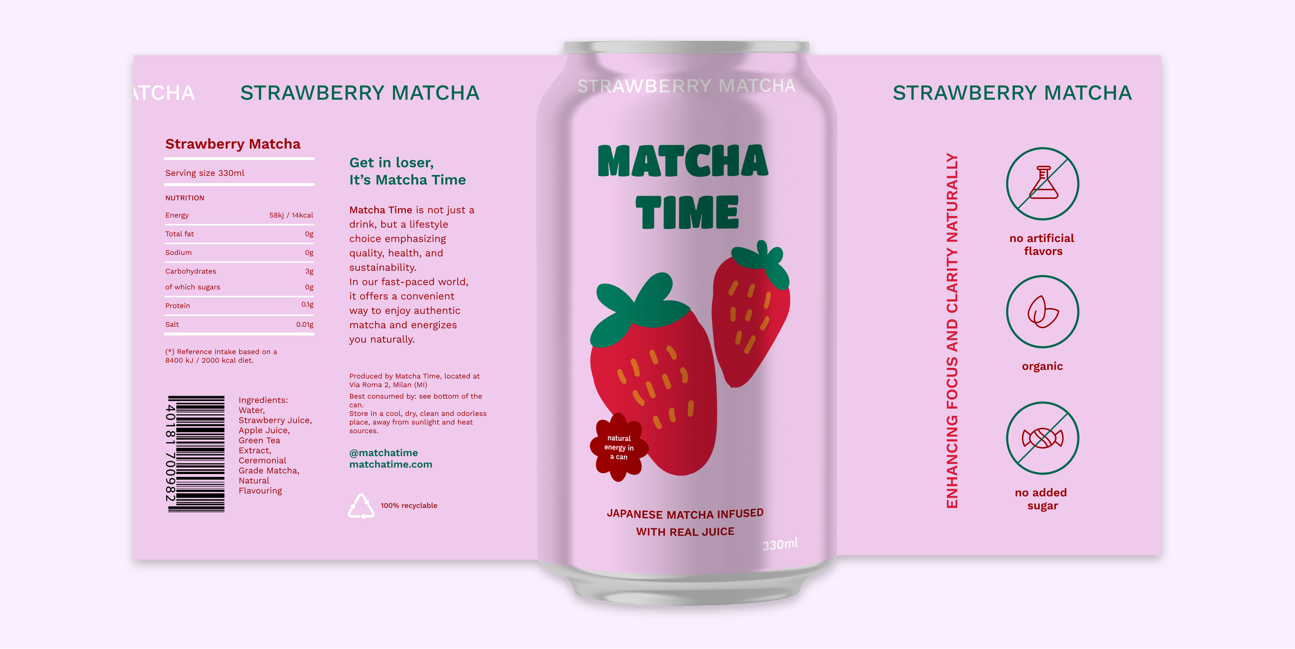
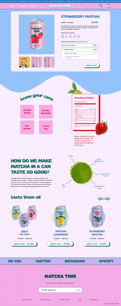
Packaging and Label
The packaging for “Matcha Time” is designed with a strong focus on sustainability. Beverage cans are made entirely from recycled aluminum, significantly reducing environmental impact and promoting a circular economy. Aluminum is infinitely recyclable, meaning each can be reused without any loss in quality, thus minimizing the need for new material production.
The label is created in compliance with Italian and European standards, ensuring that all necessary information is clearly visible and easily understandable for the consumer. This includes a complete list of ingredients, highlighting that the drinks are organic, non-GMO, and contain no added sugars. Detailed nutritional information is provided, including calories, fats, carbohydrates, sugars, and proteins, allowing consumers to make informed dietary choices. Recycling information is also provided, encouraging consumers to participate in environmental sustainability.
FLOW chart
I will explore the key steps and interactions that users go through, so I can optimize their path to achieve the ultimate goal, buy “Matcha Time” cans.
site map
I will explore the hierarchical arrangement of pages, outlining the structure and organization of the “Matcha Time” website.
wireframe
I will delve into the intricacies of the wireframing process, unveiling the thoughtful decisions guiding the placement of elements and interactions.
design system
This essential element ensures the uniform utilization of color schemes, typography, and UI elements, guaranteeing a cohesive and user-centric experience across the entire platform.
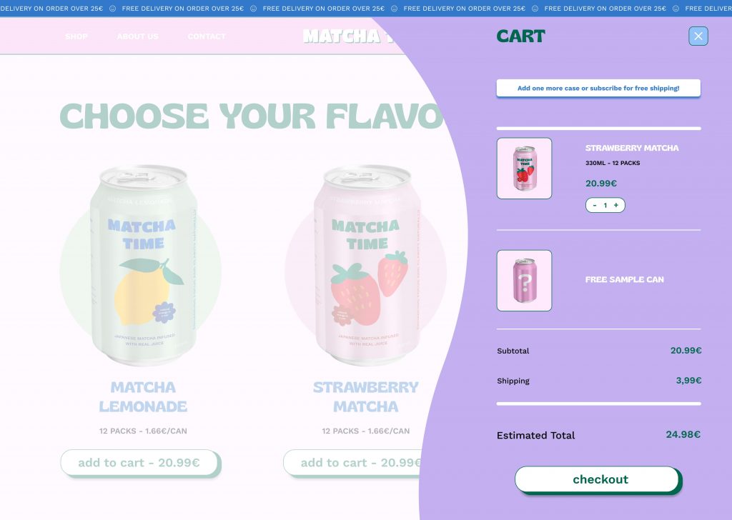
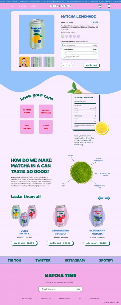
design
Below, find images showcasing the clean, modern aesthetics and user-friendly layout that reflect the commitment to quality, health, and sustainability. Dive into each section to see how the vibrant essence of matcha beverages is brought to life online.
challenges
Undertaking the “Matcha Time” project, which aims to introduce canned matcha beverages to the Italian market, involves navigating several significant challenges. One of the primary hurdles is the cultural difference between Japan and Italy. Italians have a deeply ingrained coffee culture, and introducing them to matcha involves more than just offering a new beverage; it requires educating them about matcha’s benefits, its rich history, and traditional preparation methods. This educational effort must be carefully planned and executed to build awareness and interest in a market unfamiliar with matcha.
Flavor adaptation is another critical challenge. Matcha has a distinctive taste that might not align with Italian preferences. Therefore, it’s essential to adjust the flavor profiles of the beverages to appeal to local tastes while maintaining the authenticity of traditional matcha. This requires extensive market research and product testing to find the right balance.
Creating a brand identity that resonates with both Japanese culture and Italian preferences is also crucial. The brand needs to convey the authenticity of Japanese matcha while being relatable and attractive to Italian consumers. This extends to the user experience (UX/UI) design, where the challenge lies in making the product packaging and digital platforms both engaging and easy to navigate for a diverse audience.
Furthermore, substantiating health claims about matcha, such as its antioxidant properties and effects on mental clarity, requires solid scientific evidence. This is essential not only for gaining consumer trust but also for meeting regulatory standards.
Overall, successfully launching “Matcha Time” in Italy demands a comprehensive approach that addresses these various challenges through strategic planning, cultural sensitivity, effective branding, and robust marketing efforts.
conclusion
In conclusion, the “Matcha Time” project faces significant challenges, especially in the realm of user experience (UX) and user interface (UI) design. Introducing canned matcha beverages to the Italian market requires creating an intuitive and engaging product experience that appeals to Italian consumers while maintaining the authenticity of Japanese matcha culture.
Key to this is designing visually appealing packaging and user-friendly digital platforms that educate consumers about matcha’s benefits and history. The customer journey must be seamless, from initial awareness to purchase and beyond, with optimized online shopping experiences and engaging in-store displays.
By focusing on these aspects, “Matcha Time” can effectively introduce Italian consumers to matcha, fostering appreciation and adoption of this unique beverage.