
CASE STUDY
Optimizing Group Finances: A Successful Redesign Journey with Splitwise
TIMELINE
1 week – JAN 2024
PLATFORM
App iOS
MY ROLE
UI – UX Designer
What is Splitwise?
Splitwise is an expense-splitting app that simplifies the process of recording payments and dividing expenses among friends or a group of people. Whether it’s sharing costs for lunches, travel, or drinks, Splitwise keeps track of who owes what.
The app identifies the members of the group who owe money to those who have contributed more than they have received, providing equitable expense management.
Why Splitwise?
During a recent trip with my friends, we encountered the typical scenario where not all expenses could be easily split. In such cases, one person often ends up covering the costs, and that’s when we turned to Splitwise to keep things fair. However, despite having used the app back in my university days, I was surprised to find that its user interface hadn’t changed much—it retained the same rather uninspiring design.
Discussing the app with my friends, we collectively observed that the overall flow, navigation, and the process of adding expenses remained somewhat confusing. Additionally, dealing with the monetary aspect was cumbersome, especially when it came to settling up through various channels like bank transfers, PayPal, or even cash. The friction in these processes added an extra layer of inconvenience to an otherwise helpful tool.
The app’s static design, coupled with a somewhat convoluted process for inputting expenses, led to frequent errors. Dealing with shared expenses among friends is sensitive, and these hiccups not only caused frustration but also introduced an element of apprehension, considering the financial nature of the transactions involved.
Design Process
In the initial phase of the design process, I conducted in-person interviews to gather user insights, identify pain points, and establish redesign goals.
The subsequent meticulous examination of the user flow allowed for a detailed assessment of the app’s navigation, pinpointing specific pain points and informing refinements. A comprehensive site map was developed to enhance the overall structure.
Building on these insights, a focused analysis compared the original app’s limitations with the redesigned graphics, emphasizing improvements in color accessibility. The establishment of a robust design system was pivotal, ensuring consistency across visual elements and refining user interactions.
Pre-redesign user testing played a crucial role, offering valuable insights into existing challenges and guiding iterative improvements. Post-redesign testing further validated the effectiveness of implemented changes, while random screen samples showcased the redesigned interface in action. This comprehensive design process, enriched by user interviews and focused on addressing identified pain points, ultimately resulted in an enhanced and user-friendly Splitwise app.

User test - pre redesign
I conducted in-person interviews to evaluate the usability of the Splitwise app, where participants engaged in hands-on sessions, providing real-time feedback on simple operations. This approach allowed users to express their thoughts on areas needing improvement, potential design enhancements, and missing features. The interactive interviews revealed recurring pain points, guiding a meticulous analysis that resulted in a comprehensive list of user concerns. This insightful examination laid the groundwork for the app’s redesign, prioritizing a user-centric approach to address challenges and enhance overall usability.
PAIN POINTS
- Outdated UI: the user interface feels outdated, hindering the overall aesthetic and potentially impacting user engagement.
- Limited Color Diversity and Accessibility: the limited color diversity impacts visual appeal and accessibility for users with different needs.
- External Payment Methods: the absence of an in-app payment feature necessitates users to resort to external methods, introducing an additional step and potential inconvenience.
- Absence of Virtual Mutual Fund Feature: a notable gap is the absence of a feature allowing users to create a virtual mutual fund for shared expenses related to trips or household expenses.
- Confusing “Add an Expense” Page: the current interface for adding expenses is unclear, causing confusion for users and potentially leading to errors in data entry.
- Unclear Activity UX: the user experience within the activity section lacks clarity, making it challenging for users to understand and interpret their financial interactions.
- Manual Calculation for Taxes/Delivery/Tip: inability to include taxes, delivery charges, or tips in the split without manual calculation adds complexity and may lead to inaccuracies.
- Lack of Transaction History: a missing feature is a comprehensive list of all transactions, leaving users without a consolidated view of the money they have given or spent.
goals
- Visual Overhaul: Undertake a comprehensive visual redesign to modernize the app’s overall aesthetic appeal. This encompasses improvements in color schemes, typography, and overall layout, creating a more engaging and contemporary user interface.
- Wallet Integration: Integrate a user-friendly wallet payment feature, providing users with a centralized and secure method for managing their financial transactions within the app. This inclusion aims to enhance convenience and flexibility in handling various payment scenarios.
- Group Fund or Money Swap: Introduce innovative features like ‘Group Fund’ to streamline shared expenses within groups. Alternatively, explore a ‘Money Swap’ functionality, allowing users to transfer funds seamlessly within the app. These additions aim to simplify financial coordination among users and enhance group dynamics.
- OTP-Based Login: Enhance the app’s security measures by implementing a robust OTP-based login system. This ensures a more secure authentication process, providing users with increased confidence in the safety of their personal information.
- Streamlined Expense Addition: Simplify the process of adding expenses by refining the user interface and introducing features such as ‘Delivery’ and ‘Taxes’ options. These enhancements aim to make the expense-tracking process more intuitive and comprehensive, catering to various transaction types and providing users with a clearer financial overview.
FLOW chart
This segment offers valuable insights into the navigation and intuitive pathways crafted to enhance the new user experience.

site map
This segment offers valuable insights into the navigation and intuitive pathways crafted to enhance the new user experience.
LOGO
The logo redesign encapsulates the dynamic transformation of Splitwise from its static origins to a more contemporary and fluid representation.
This revitalization introduces a vibrant palette shift from the traditional green and grey to an electrifying fusion of dark blue and pink hues.
This change not only reflects contemporary design trends but also acts as a symbolic signal, marking the app’s evolution and injecting it with vibrant energy.
design system
This integral component delineates the consistent application of color schemes, typography, and UI elements, ensuring a harmonized and user-centric experience throughout the entire platform.
Redesign
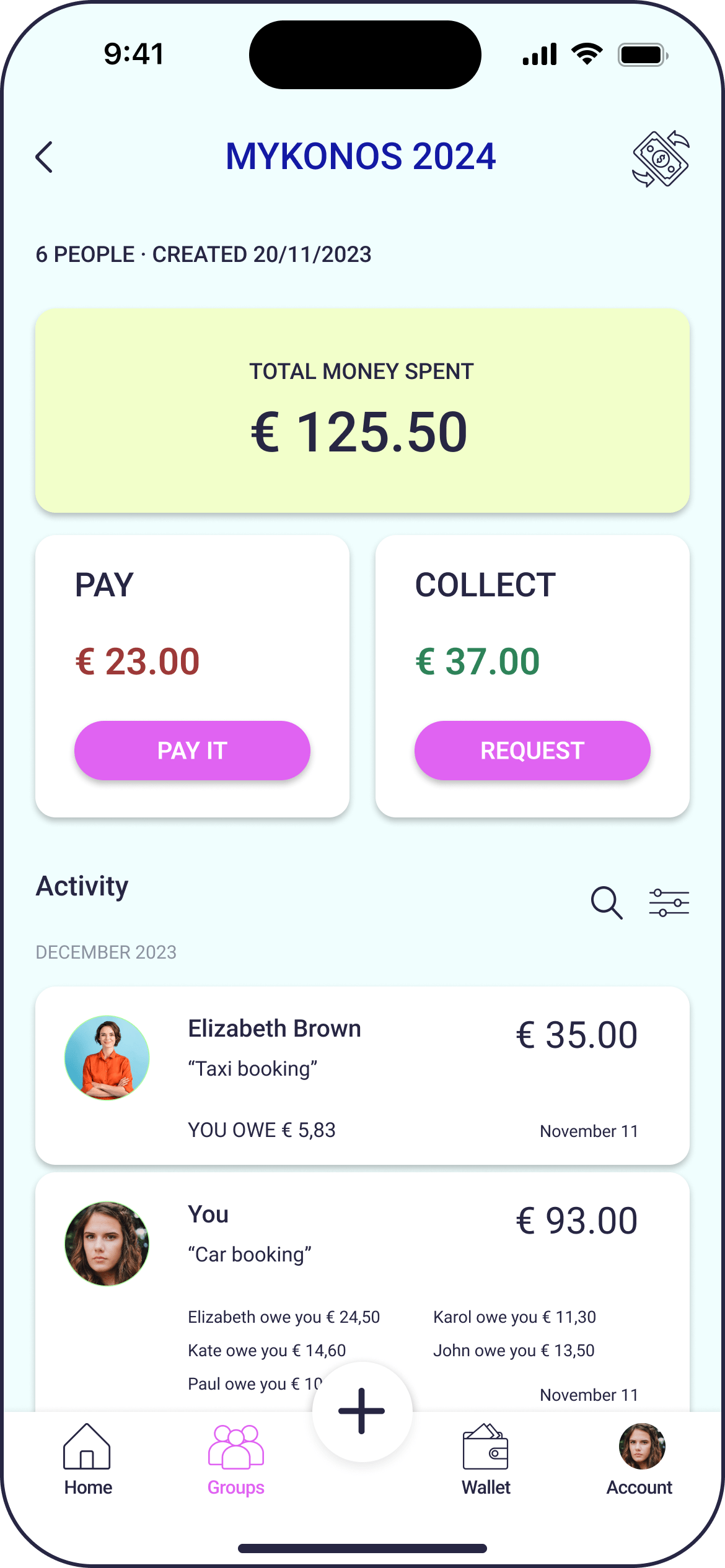
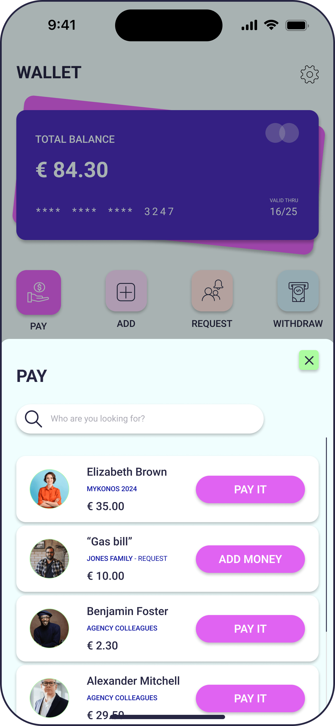
In the redesign of Splitwise, I changed “You Owe” to “Pay” and “They Owe You” to “Collect” for improved clarity and user understanding. “Pay” is more action-oriented, leaving no room for ambiguity, while “Collect” encourages a proactive approach to receiving owed amounts. These changes aim to streamline the user experience by providing clearer and more actionable language, reducing potential confusion, and promoting straightforward interaction with the app’s financial features.
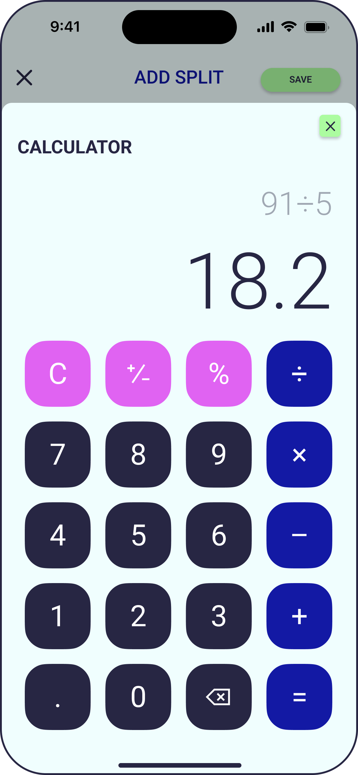
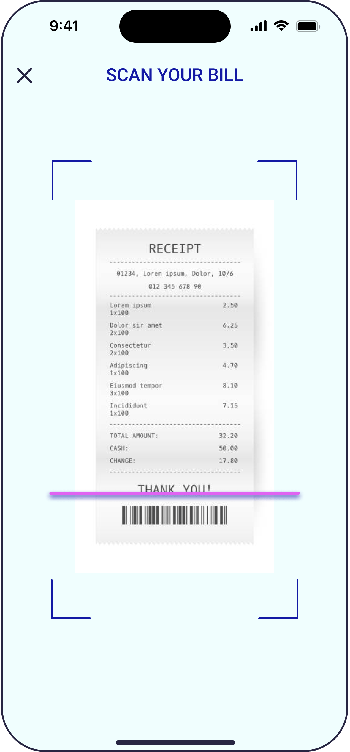
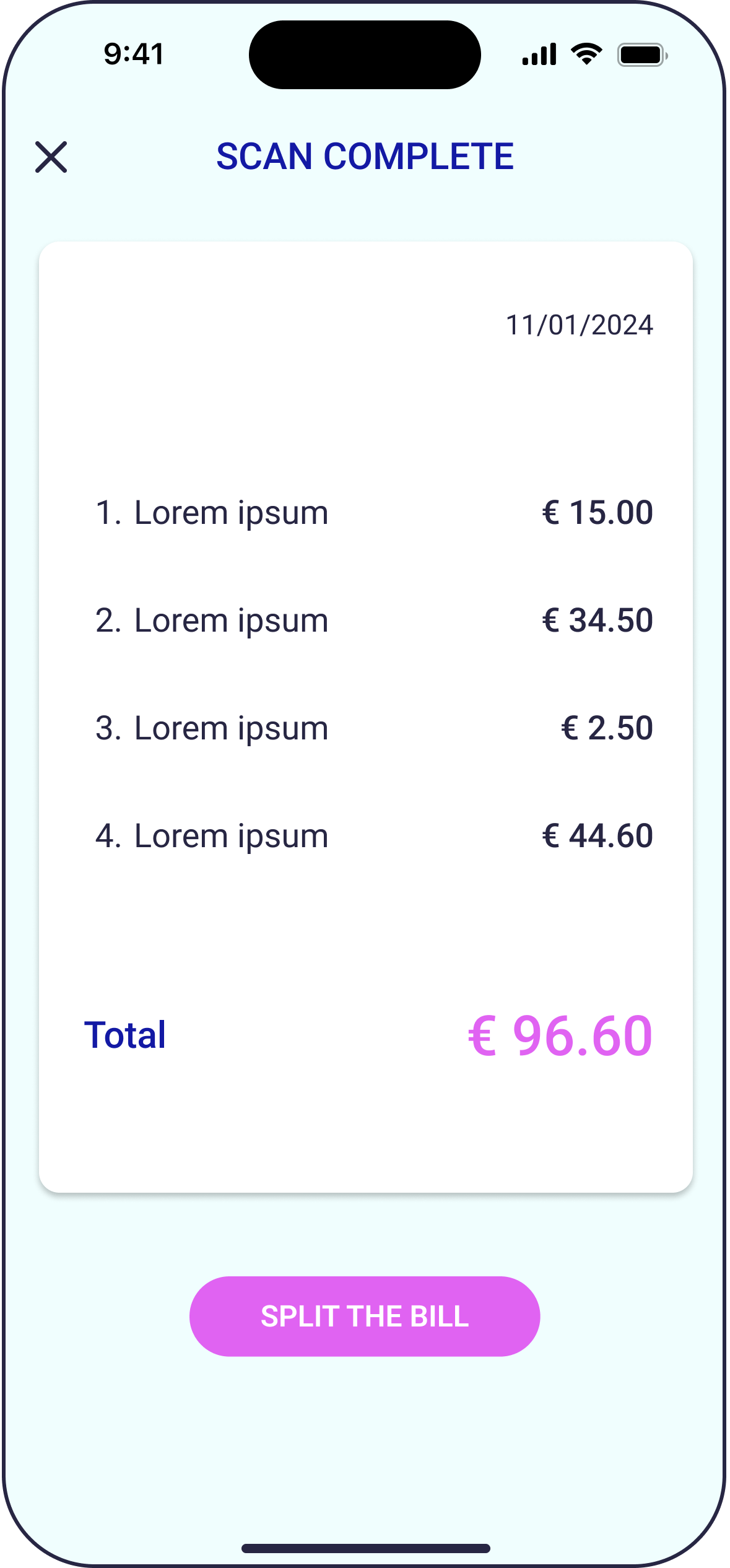
In the redesign of Splitwise’s “Add Expense” screen, the focus was on simplifying the expense-adding process and enhancing user convenience. Key changes include a revamped and more user-friendly expense entry process, the introduction of receipt scanning for time-saving, an integrated in-app calculator for seamless calculations, improved visualization of the “How to Split” feature for better clarity, and the inclusion of taxes and delivery fees for accurate expense sharing. Additionally, a two-date system with automatic reminders was introduced to facilitate timely settlement, and a “Repeat” option was added for easily replicating recurring expenses without manual re-entry.
These enhancements collectively aim to streamline the user experience and address common pain points associated with splitting expenses among friends.
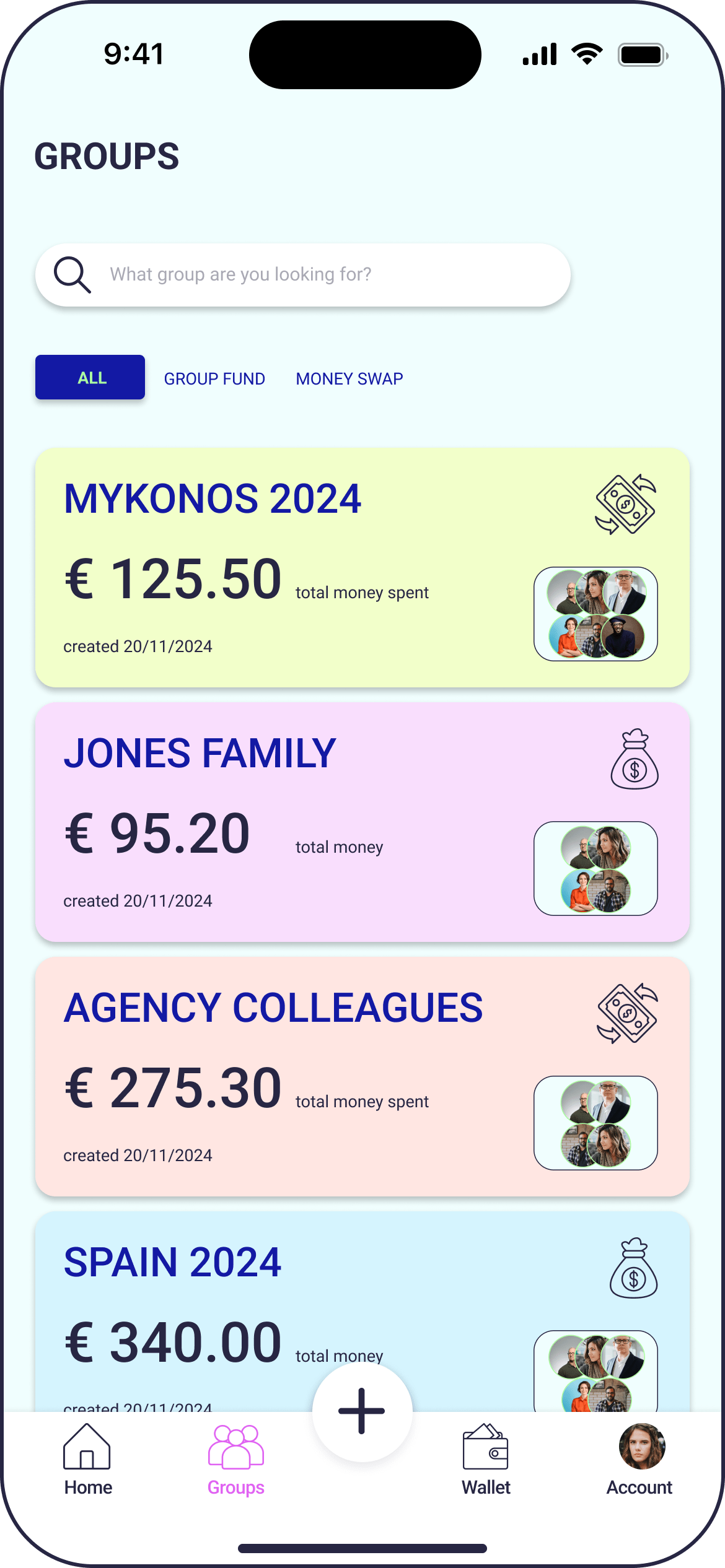
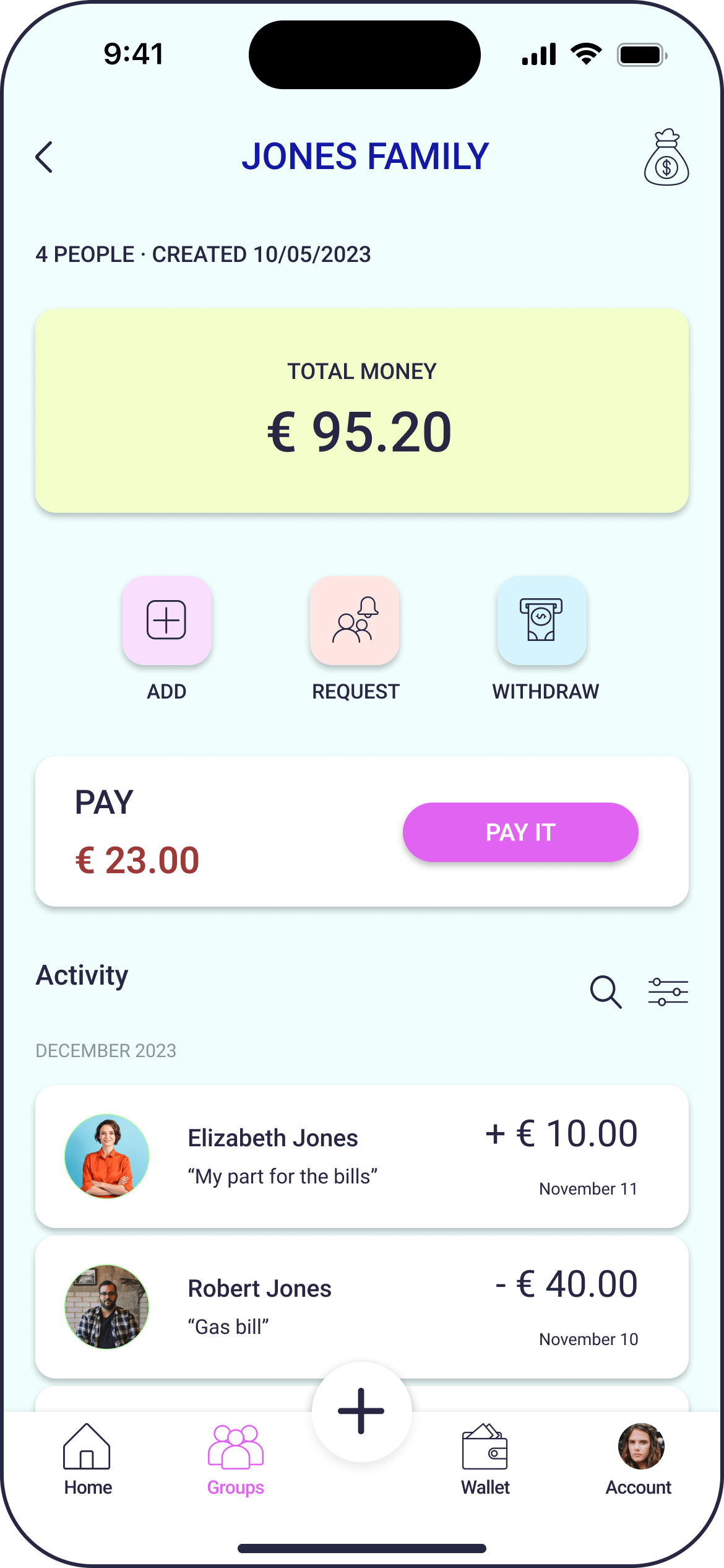
Acknowledging the lack of a dedicated app—like the feature once attempted and later removed by PayPal—that seamlessly integrates a group fund for shared expenses during vacations or group activities, I took on the task of enhancing this aspect in Splitwise.
This entails the creation of two distinct group types, Group Fund groups, which enable members to contribute to a shared fund for various purposes, fostering collaborative resource pooling, and the Money Swap groups, which were already part of the app’s features, enabling members to seamlessly transfer funds among themselves to address specific financial needs or obligations.
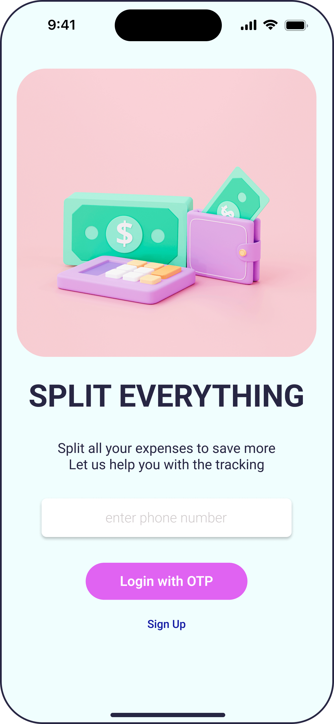
The decision to switch from traditional login to one-time-password (OTP) login in the Splitwise redesign focuses on enhancing security, user experience, and accessibility. OTP provides an added layer of security by sending a unique code to users’ mobile devices, reducing vulnerability. This streamlined and mobile-centric approach aligns with modern user expectations, minimizing the friction in onboarding. The adaptation to industry trends, emphasizing OTP-based authentication, contributes to an improved overall user experience.
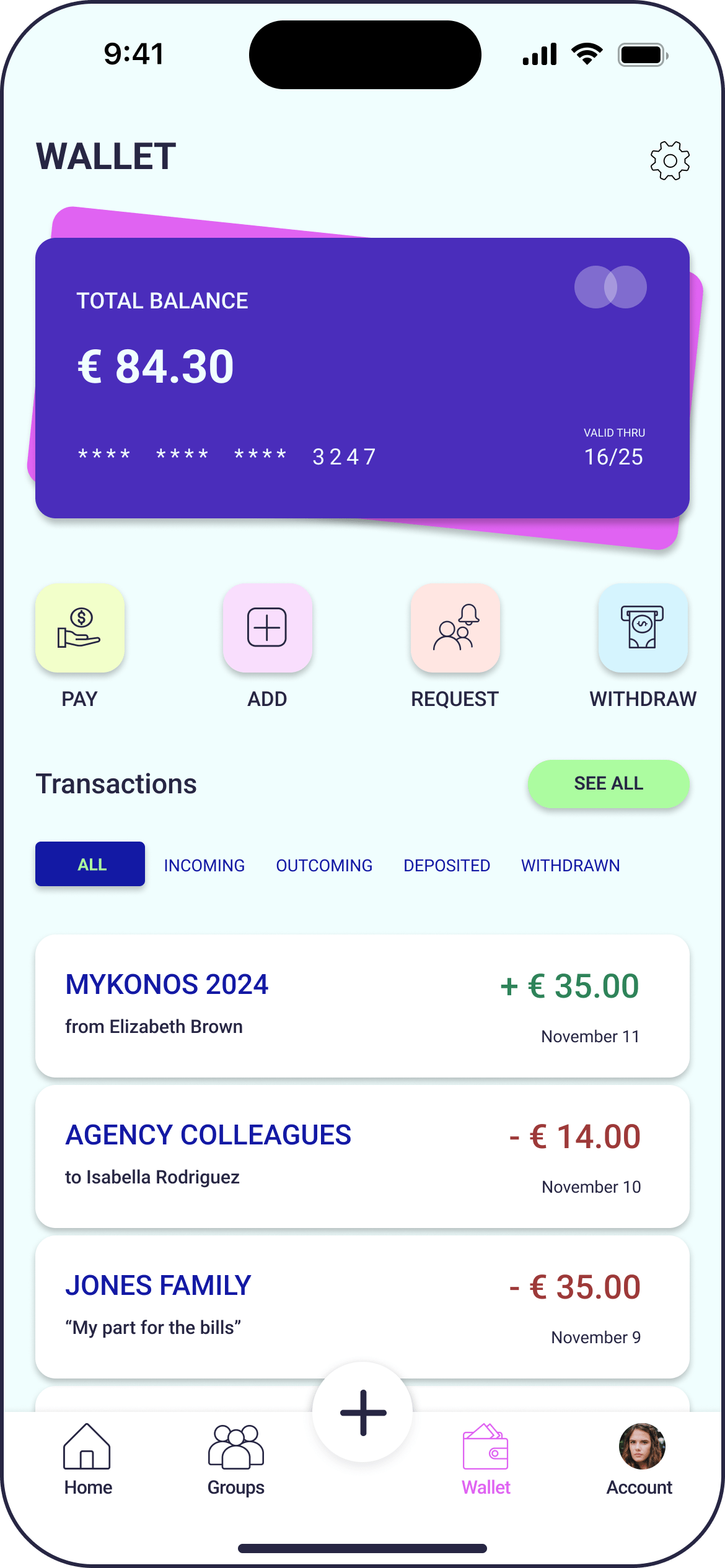
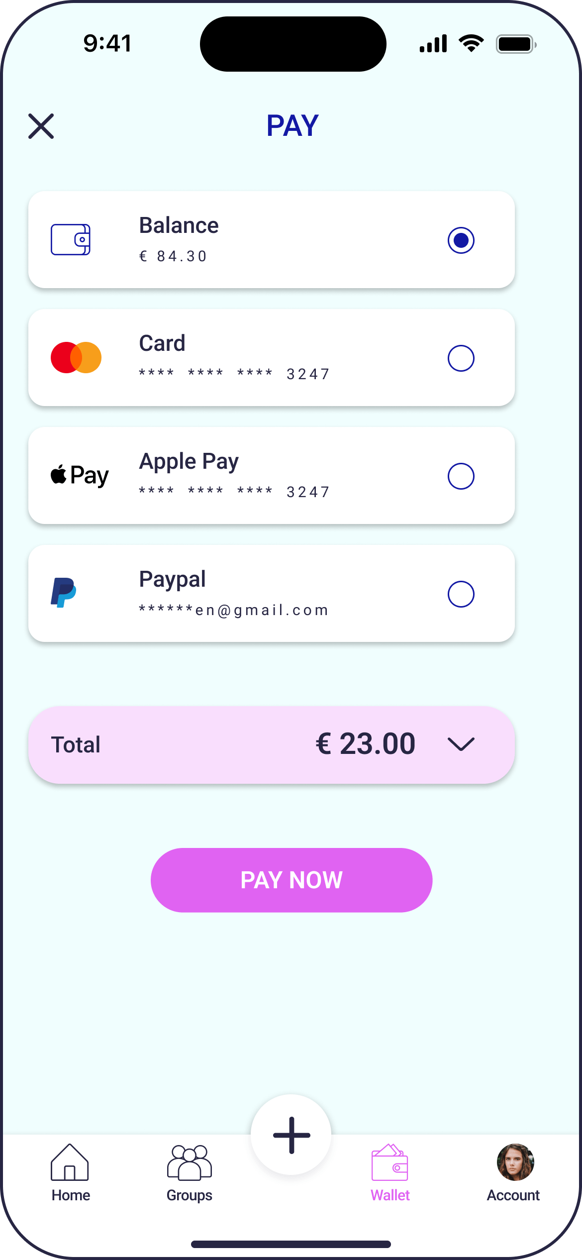
This new “Wallet” functionality redefines the way users handle transactions within the app, offering a centralized and secure method. With this update, convenience and flexibility are prioritized, empowering users to effortlessly manage diverse payment scenarios. From splitting bills with friends to managing group expenses or handling personal transactions, the wallet payment feature ensures a seamless and stress-free experience, putting users firmly in control of their finances.
Users can choose between a variety of payment options, ranging from traditional card payments to utilizing existing balance funds stored within the app.
User test - post redesign
I conducted a series of user tests after the redesign with a diverse group of participants representing the app’s target demographic. Tasks included expense creation, fund management within groups, navigation, and feedback on new features.
- Users found the redesigned expense creation process more intuitive and user-friendly.
- Positive feedback on the addition of receipt scanning, saving time and effort in manual entry.
- Users praised the introduction of shared funds within groups as a powerful and convenient feature.
- Improved “How to Split” visualization received positive feedback for clarity and ease of understanding.
- Users appreciated the simplified navigation, finding it more straightforward to locate and use features.
- The introduction of taxes and delivery fee inclusion was well-received for promoting transparency in expense sharing.
Participants expressed a high level of satisfaction with the redesigned Splitwise app, noting improvements in usability, clarity, and efficiency.
The addition of new features, particularly shared funds, received acclaim for addressing pain points in expense management. The app’s overall user experience was deemed more cohesive, contributing to a positive and seamless financial coordination within groups.
Conclusion
The Splitwise redesign has successfully enhanced user experience by introducing intuitive features, streamlining navigation, and promoting financial transparency. Positive feedback from user testing validates the effectiveness of the changes, contributing to a more user-friendly and cohesive platform for seamless group expense management.